Field guide
How-to docs people can actually follow
"Click the gear icon in the top right."
There are three gear icons in the top right. The person following your doc clicks the wrong one, lands somewhere unfamiliar, and messages you. Now you're doing the task for them over chat, one screenshot at a time, which is exactly what the doc was written to prevent.
Every how-to doc is written by someone who already knows where the button is, for someone who doesn't. That gap is the whole problem. Prose can't close it, because prose describes a screen the reader is looking at with different eyes.
An annotated screenshot closes it. Not a screenshot. An annotated one. The difference is this article.
Why a plain screenshot isn't documentation
A raw screenshot shows everything at equal weight. Forty controls, all the same size, none of them saying "me."
The reader has to search it. Searching is work, and it's the same work they'd have done with no screenshot at all, just on a smaller picture.
Documentation is a screenshot plus a decision about where to look. Three marks make that decision for the reader: an arrow, a box, and a number. Add a line of text when the why isn't obvious. That's the entire toolkit for most how-to docs, and most people misuse it in the same handful of ways.
The four marks, and what each one is for
Arrow: the one thing to click. One arrow per screenshot. Two arrows is a question ("which first?"), and a question is what you were trying to eliminate. If a step has two clicks, it's two steps.
Box: the area to look in. A rectangle around the panel, the row, the section. It says "everything you need is inside this," so the reader can ignore the rest of the screen. Boxes are for context. Arrows are for action.
Numbered badge: the order. 1, 2, 3 on the screen, in the order the reader does them. This is the mark that turns a picture into instructions. One screenshot with numbered badges carries five steps that would otherwise take five images and five paragraphs.
Text: the why, in one line. Not what to click; the badge does that. Why: "Turn this off or the export includes archived rows." The one sentence that saves them from the mistake you made.
The highlighter earns a mention for one specific job: a row in a table, a line in a log, a sentence in a settings description. Anything wide and short. Don't use it on buttons. That's an arrow's job.
The pen is for signatures and sketches. Leave it out of docs. Freehand circles make every doc look like a ransom note.
Numbers for sequence, letters for labels
Here's a distinction that will improve your docs today.
Numbers say "do this, then this." A sequence. The reader follows them in order.
Letters say "this is A, this is B." Labels. No order implied. You use them when the text needs to refer to parts of a screen: "A is the total you're checking. B is where it should match."
Mixing the two on one image is the move. Numbered badges on the clicks, lettered badges on the things the text refers to, and the reader never confuses "step 3" with "the third thing on screen." A tool that keeps separate counts for numbers and letters makes this free. Drawing circles by hand and typing "3" into a text box does not, especially the third time you reorder the steps.
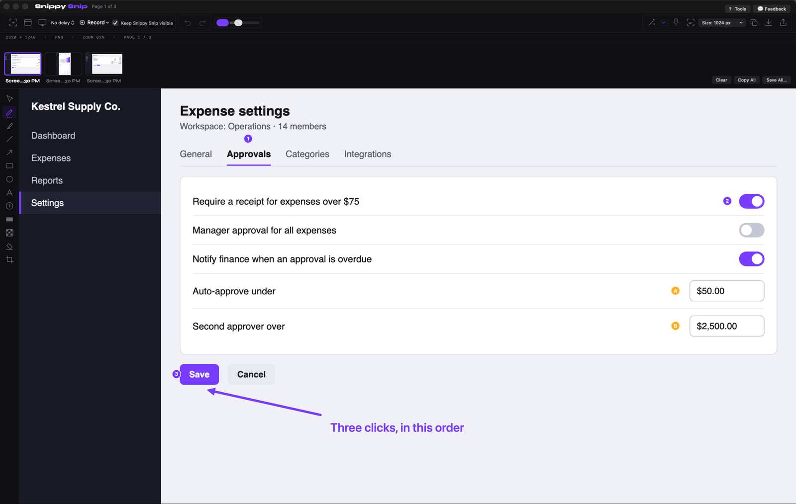
Numbered badges carry the order, lettered badges mark the two fields to fill, one arrow and one line of text do the rest. Invented settings page.
Six rules that make docs followable
Most bad docs break one of these. Fix the one you break and watch the support messages drop.
1. One decision per screenshot. If the reader has to do two unrelated things, that's two images. A screenshot with nine badges is a maze with numbers on it.
2. Crop to the decision. The reader needs enough of the screen to recognize where they are, and no more. A full-screen capture with one tiny arrow in the corner is a "find the button" puzzle. Crop to the panel and the arrow becomes obvious.
3. Badge in reading order. Top to bottom, left to right, unless the click order genuinely differs. When it does differ, that's exactly when the numbers earn their keep.
4. One color for action, one for context. Red for arrows and badges, something calm for boxes. Rainbow annotation makes every mark equal, and the reader is back to searching.
5. Put the why on the image, not under it. Captions get separated from images the moment a doc is copied into a wiki, a chat, or an email. The image should survive on its own.
6. Blur what isn't theirs. Your docs show your data: customer names, account numbers, coworkers' inboxes. A how-to screenshot lives forever and gets forwarded to people you never wrote it for. Blur at capture time, every time.
The workflow, start to finish
Docs that never get finished are usually written in the wrong order. Here's the order that works.
Do the task once, capturing as you go. Every screen you touch, take a shot. Don't annotate yet. Getting the sequence right is the job; the marks come after.
Then annotate in one sitting. Arrow, box, badges, one line of text, per screen. This is faster than it sounds, because each screen is one decision and you already made it while doing the task.
Keep the reference on top while you write. When you're writing the text for step four, you want step four's screenshot visible, not buried under the wiki editor. Pin it. A screenshot floating above your other windows while you type from it is the difference between writing from memory and writing from the screen. It's also how the reader should follow the doc: your screenshot pinned in the corner, their real screen underneath.
Name the shots as you go. "approvals-1", "approvals-2". Later you will thank yourself, and so will whoever updates the doc after you.
Here's how fast that matters. The second slide on Snippy Snip's homepage carousel was a photo of the editor taken 2026-07-21, tools across the top. Since then the annotation tools moved to a vertical strip on the left. I caught it this morning, 2026-09-10, at the start of the day: a seven-week-old shot showing a toolbar the app no longer has, on the front page. I re-rendered it the same day. A how-to doc rots exactly like that, one UI change at a time, and the screenshots go stale before the words do. Name the files after the screen they show, and the day that screen changes you can find every shot that needs retaking in one search.
Save the set at once. If your tool keeps the session together, save the whole batch, numbered, into the folder the doc lives in. Twelve screenshots, one save.
What your Mac already does
Take a screenshot with ⌘⇧4, click the floating thumbnail, and you're in Apple's Markup. It has arrows, shapes, text, and a highlighter, and for one arrow on one screenshot it's fine. I wrote a full guide to the built-ins and I meant every good word in it.
Where Markup stops is exactly this article. There are no numbered badges, so a five-step image means five circles and five text boxes drawn by hand, then moved in pairs when the layout shifts. Nothing pins. And nothing keeps the twelve screenshots of one doc together; they're twelve files on your desktop named after timestamps.
For a doc a month, live with it. For a doc a week, it's the difference between docs that get written and docs that get promised.
So take the last how-to doc you wrote and look at its first screenshot. Where is the reader supposed to look? If you can't answer in one word, neither can they.
The tool I use
Snippy Snip is what I built after 22 years on Windows and no Snipping Tool on my Mac, and the annotation editor is the part that's free.
Free: arrows, boxes, highlighter, text, crop, and numbered and lettered step badges that keep separate counts and renumber themselves when you delete one. Blur and redact. A session carousel that keeps every shot from a doc in one window, with names you choose and a Save All that writes them out numbered. No watermark, no nag.
Pro, $19 once: pinned shots that float above every window while you write from them, full-page web capture for the settings pages that scroll, and screen recording for the steps that are easier to show than to draw. No subscription, every update included.
Free forever, no watermark. Pro is $19, once.

Twenty years in finance and operations, exited founder, still closing the books monthly across his own businesses. Built Snippy Snip after 22 years on Windows. LinkedIn